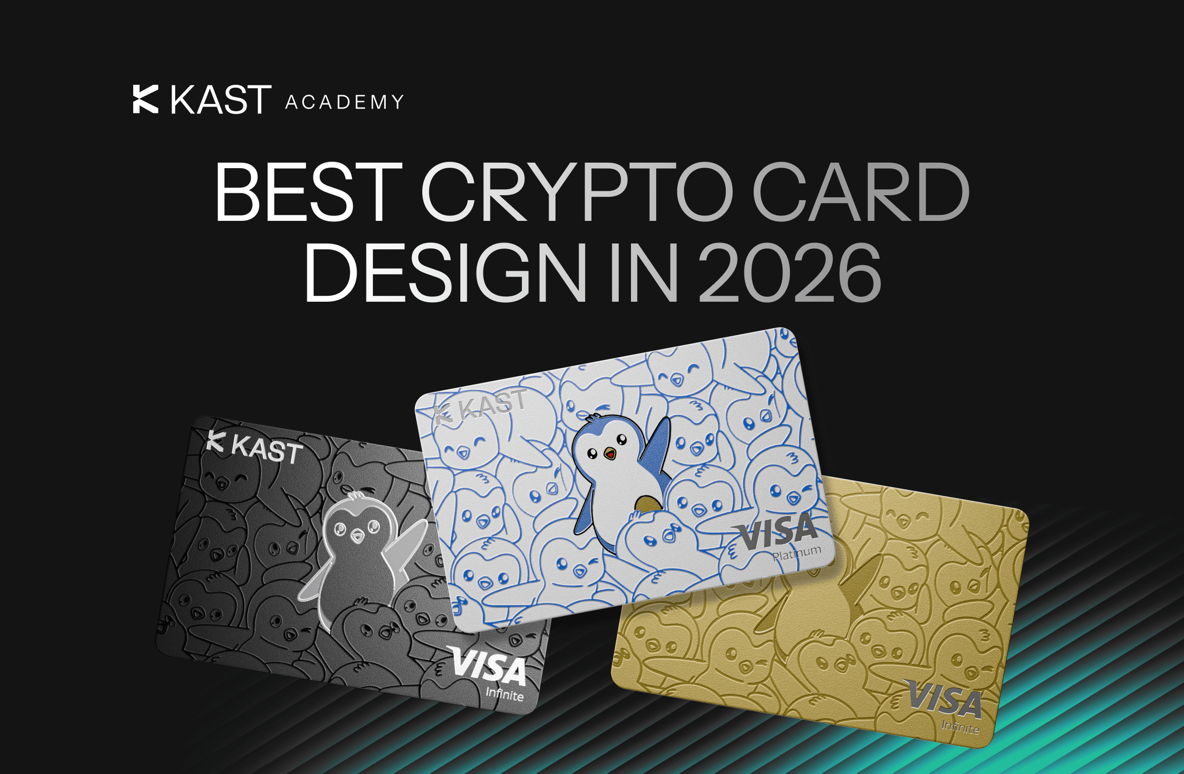
Best Crypto Card Design 2026: Why Pengu Stands Out
Most crypto cards try to disappear: matte finishes, minimal branding, and a “fintech-first” look that feels safe at checkout. The KAST Pengu Card takes a different path by putting Pudgy Penguins front and center.
Key Takeaways
- Most crypto cards borrow a quiet fintech look to feel familiar and low-friction in everyday use.
- That approach helps with acceptance and usability across different environments, but flattens differentiation.
- The KAST Pengu Card leans into identity and culture in a way that can make KAST feel more personal.
If you line up a bunch of crypto cards, they start to look strangely familiar.
Most of them follow the same idea: look like fintech, not crypto. Matte black or white. A small logo in the corner. No illustration, no character, nothing that signals personality. “Premium” usually means using less ink, less color, less everything.
That choice does several things at once. It positions the card as legitimate, something that sits comfortably next to any mainstream credit card.
It also keeps checkout smooth. Nobody’s asking you what that card is or why it looks different. And if there are tiers, the design quietly tells people where you sit without you saying a word.
It’s a safe system. It works. However, it also means most cards end up looking the same. The KAST Pengu Card takes the opposite route. It’s designed not to blend in, but to be remembered.
Crypto Card Design Trends
Most crypto cards stick to a quiet fintech look so you can use them anywhere without drawing attention.
That consistency makes them easy to use in any setting, but it also removes most visual differences. Cards from completely different platforms end up looking almost identical when you put them next to each other.
Once you notice the pattern, you can’t really ignore it.
Exchange Cards: Bybit & Bitget
These cards go fully corporate.
Dark palettes, metallic gradients, clean typography, strict layouts. Very little illustration. Everything is controlled. The goal is obvious. Look global. Look predictable. Look like something a bank would issue.
And they do exactly that. You can use them anywhere and nobody gives them a second look.
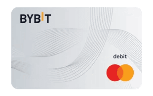
Bybit Card
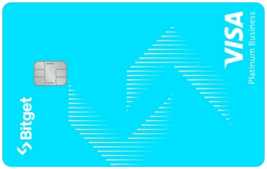
Bitget Card
Tiered Crypto Cards: Crypto.com
Here the design follows the tier system.
Move up a level, the card gets darker and more restrained. The highest tier lands on an all-black finish. The signal is clear without explanation.
You hand it over, and the design does the talking for you.

Crypto.com Card
Fintech Card Design: Revolut
Revolut keeps things neutral.
The base card works everywhere. If you want something with personality, you unlock it or customize it through your plan. Most of that expression sits inside the app, not on the card you’re holding.
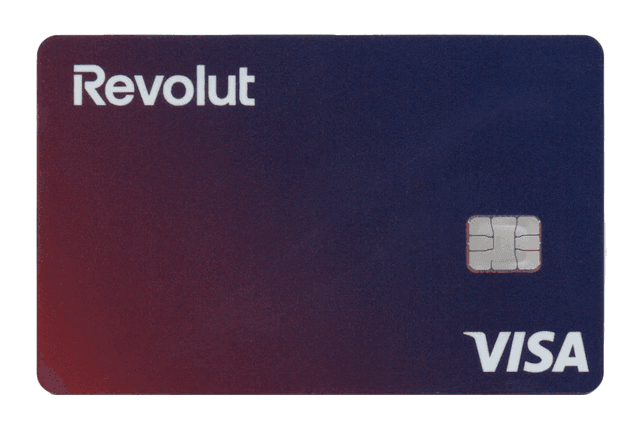
Revolut Card
KAST Base Card Design
KAST sits in that same space.
Clean. Premium. Modern. Nothing loud. Nothing that pulls attention when you’re paying. You can use it anywhere and move on with your day.
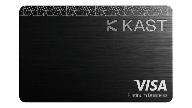
KAST Card
And then there’s the Pengu Card.
KAST Pengu Card Design and Why It Stands Out
Most crypto cards stay quiet.
The Pengu Card doesn’t.
You notice it straight away. And yes, you’re probably going to show it.
It leans fully into Pudgy Penguins. Not a small logo tucked into a corner. Actual character. Recognizable visuals. You look at it and know exactly what it is.
That changes what the card communicates. A minimal card keeps things practical. This one adds identity on top.
With Pengu, you’re getting culture, community, and a bit of play. Pudgy Penguins already carries meaning, and the card reflects that.
It signals that you’re part of that group without you explaining anything. And it doesn’t try to tone that down to look more serious.
Functionally, nothing changes. You’re still tapping the same terminals and paying the same way.
What changes is everything around that moment. You’re more likely to leave it on the table. Someone notices it. You get a question. You don’t rush to hide it.
Crypto Card Design Comparison Across Platforms
Put Pengu next to everything else and the difference is obvious.
KAST’s base card stays minimal and focused on everyday use. Clean surface, controlled branding, nothing pulling attention when you pay.
Exchange cards like Bybit and Bitget go even further in that direction. Dark palettes, structured layouts, very corporate. Everything is designed to look widely acceptable, no matter where you use it.
Crypto.com stays restrained but uses design to signal tiers. As you move up, the card gets darker until you reach a full black finish at the top.
Revolut keeps things neutral across the board. If you want personality, you add it yourself through customization.
Then you get to the Pengu Card.
It moves away from that restraint and puts Pudgy Penguins front and center. Recognizable visuals, clear identity, no attempt to dial it down. You know what it is immediately.
The others are built to blend into any setting. Pengu is built to be seen.
Choosing Your Crypto Card
A card like this works best if you care about identity as much as utility.
If you’re part of the Pudgy Penguins community, it clicks straight away. You recognize it, other people recognize it, and it carries meaning beyond the payment itself. You’re not just using it, you’re keeping it.
At the same time, it won’t fit everyone.
Some people want something low-key. Something that blends in everywhere. A more expressive design stands out in every setting, whether you want that attention or not.
And unlike minimal designs that stay visually consistent for years, a character-driven card is tied to a specific look and moment.
So you’re making a trade. Universality on one side, identity on the other.
If that trade works for you, it works really well.
Final Thoughts on Crypto Card Design Choices
If your priority is something that works everywhere without drawing attention, the minimal route makes sense.
If you want a card that reflects a specific community and shows it clearly, something like Pengu makes more sense.
It doesn’t try to look like every other financial product, instead leaning fully into Pudgy Penguins.
And if that’s your world, you’ll want people to see it.
Disclaimer: This content is provided by KAST Academy for educational purposes only and is not intended as financial advice or a recommendation to engage in any transaction. All information is provided "as-is" and does not account for your individual financial circumstances. Digital assets involve significant risk; the value of your investments may fluctuate, and you may lose your principal. Some products mentioned may be restricted in your jurisdiction. By continuing to read, you agree that KAST group, KAST Academy, its directors, officers and employees are not liable for any investment decisions or losses resulting from the use of this information.
Related articles
KAST vs Xapo Card: Comparison for 2026
Rewards are easy to compare on paper. Real life is funding, conversion, fees, and limits. This KAST vs Xapo breakdown focuses on how each card works once you actually start using it.
KAST vs Crypto.com Card: Complete 2026 Crypto Card Comparison
KAST and Crypto.com Visa Card both let you spend crypto, but the experience differs in how balances are funded, rewards are structured, and fees apply. This guide breaks down real-world costs, including FX, withdrawals, and tier-based benefits.
KAST Card vs Binance Card: Full Comparison for Crypto Spending
Wondering which crypto card actually fits how you spend? This KAST vs Binance Card comparison cuts through the hype to show how each card really works in day-to-day life. We break down fees, funding, rewards, and checkout experience so you can see what matters.